


Parijat KPI Dashboard tool NGS-010
Parijat KPI tool, or NGS-010 is an excellent software solution to interactively evaluate key performance indicators (KPI), analytics of any process. NGS-010 provides dashboards, automated calculations, alerts & dynamic data interpolations, comparing the target thresholds against the actual performances.
Faced with a million rows of numeric data in spreadsheets, or dealing with obsolete reporting packages, finding a key correlation is like looking for the needle in a haystack. NGS-010 helps with data visualization to uncover hidden good or bad trends regarding essential business metrics & analytics.
NGS-010 delivers engaging, interactive charts, graphs, maps that are easy to create, easy to revise and use. The source data may be gathered from PLCs, control systems, data acquisition systems or any other time-series ad-hoc.
NGS-010 helps harness data and generate exciting connections simultaneously engaging audience with graphics and interactivity. KPI like – production vs. machines, downtime vs. reasons, inventory vs. orders and many more – NGS-010 delivers engaging, dynamic, effective KPI and metrics dashboards that encourages user interaction and helps with informed decision support.
- Visualize the information
- Drill down into the details that matter
- Automatically receive real-time alerts when thresholds exceed
NGS-012 gives some sampling of data-driven edge that can transform the data into visuals, below:
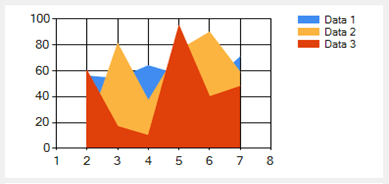
Emphasizes the degree of change over time and shows the relationship of the parts to a whole.
- 100% Stacked Area Chart Displays multiple series of data as stacked areas. The cumulative proportion of each stacked element is always 100% of the Y axis.
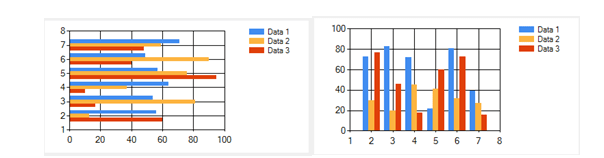
Illustrates comparisons among individual items.
- 100% Stacked Bar Chart Displays multiple series of data as stacked bars. The cumulative proportion of each stacked element is always 100% of the Y axis.
- 100% Stacked Column Chart Displays multiple series of data as stacked columns. The cumulative proportion of each stacked element is always 100% of the Y axis.
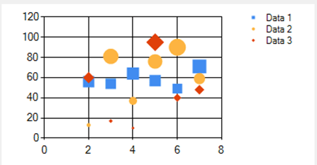
A variation of the Point chart type, where the data points are replaced by bubbles of different sizes.
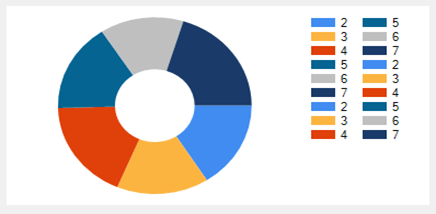
Similar to the Pie chart type, except that it has a hole in the center.
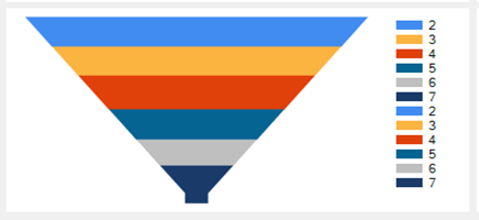
Funnel Chart
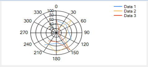
A circular graph on which data points are displayed using the angle, and the distance from the center point.
Displays data that, when combined, equals 100%.
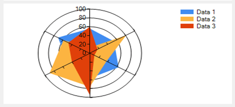
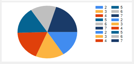
A circular chart that is used primarily as a data comparison tool.
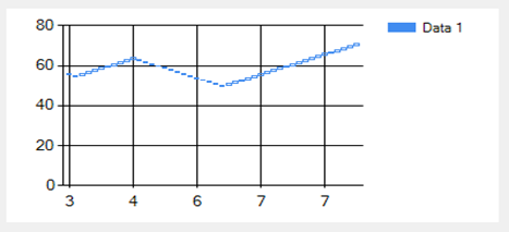
Displays a range of data by plotting two Y values per data point, with each Y value being drawn as a line chart.
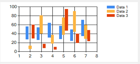
Displays separate events that have beginning and end values.
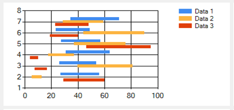
Displays a range of data by plotting two Y values per data point.
Displays a series of connecting vertical lines where the thickness and direction of the lines are dependent on the action of the price value.
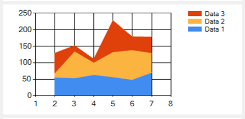
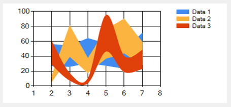
An Area chart that stacks two or more data series on top of one another.
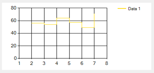
Similar to the Line chart type, but uses vertical and horizontal lines to connect the data points in a series forming a step-like progression.
There is an adapter application that allows user to connect & populate time-series data from any source to a common format that the NGS-012 tool uses to publish. Drivers for many PLCs, SCADA & other systems are also available.
Options
- With Hardware using MS Windows.
- With Hardware using Linux but with limited software capabilities.